We are happy to announce the first big update of the year. It's full of improvements that will help you present your content even better and make your designs even more interesting.
Let's take a look:
Let's take a look:
Make a link from a Container element
This may look like e small feature, but it may have a big impact on your designs. Now you can combine and style multiple elements inside a container and make them all part of a button.
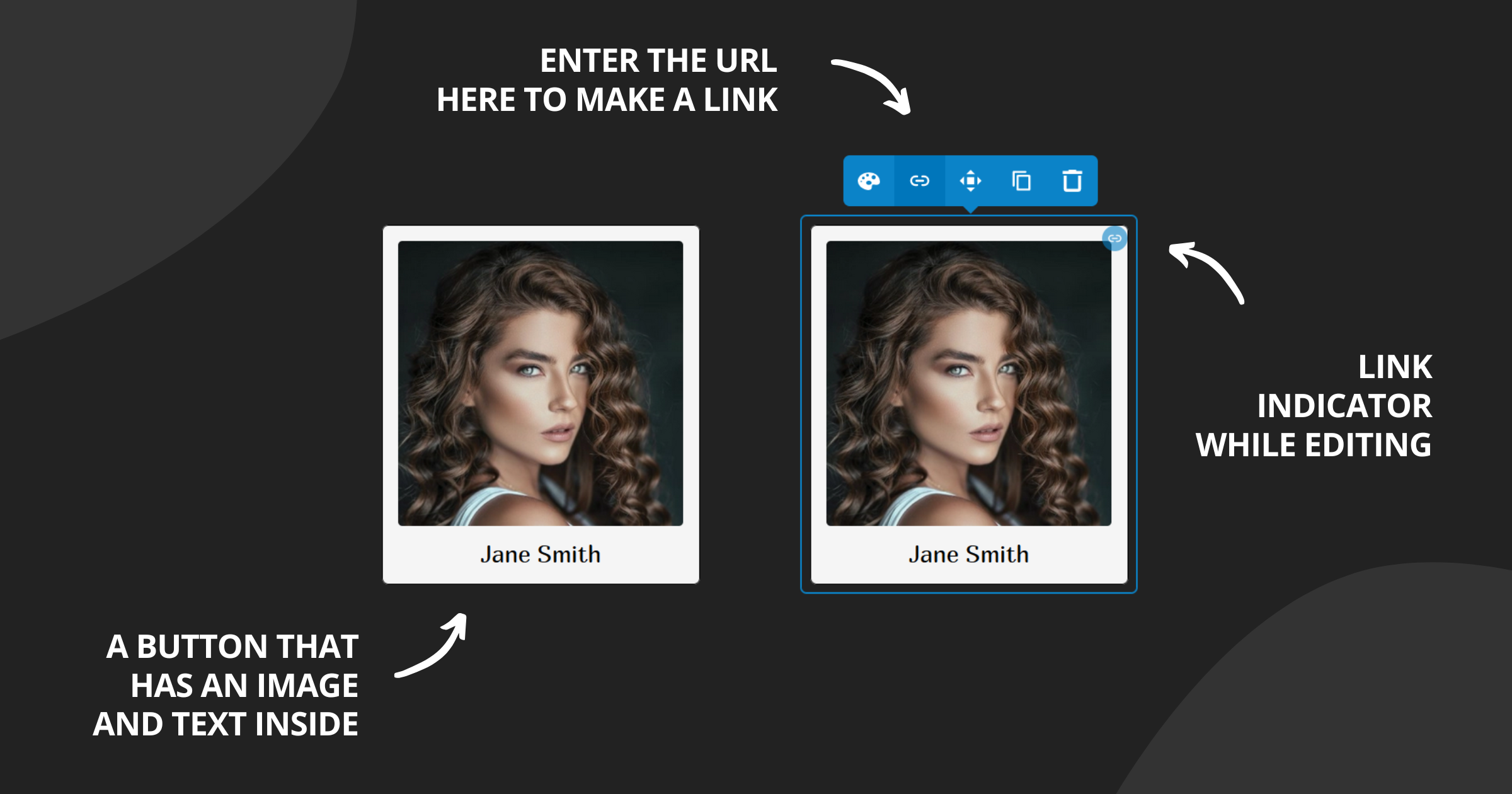
To add a link, hover over the container element and click the link icon in the toolbar. Then enter the URL of the page you want to link to.
While editing you'll see a blue circle indicating that there is a link. You can click on it to activate it. You can also modify the content inside the container. Disable content editing (from the main toolbar) to see the link the way your visitors will see it.
While editing you'll see a blue circle indicating that there is a link. You can click on it to activate it. You can also modify the content inside the container. Disable content editing (from the main toolbar) to see the link the way your visitors will see it.
Customize uploaded videos
There are a few new options for the Video element when a video is uploaded (not embedded from an external service).
You can now upload an image that will be used as a poster (visible before the video is played). Its aspect ratio must match the video's aspect ratio. You can also enable "autoplay", "muted by default", and "loop".
You can now upload an image that will be used as a poster (visible before the video is played). Its aspect ratio must match the video's aspect ratio. You can also enable "autoplay", "muted by default", and "loop".
Create up to 6 columns
The Columns element now support up to 6 columns. You may try the Container element if you need more.
More layout options for Columns
You know you can arrange columns vertically on small screens. Now you can also arrange them vertically but in reverse order. This means the last column will be first when vertical.
More layout options for Containers
The elements in the container can be arranged vertically (this is by default) or horizontally. Now two new options allow vertical and horizontal direction but in reverse order (from last to first). This is really valuable when configuring for small screens.
You can also align items at the start, the center, or the end of the container, but also with automatic space between them. If the items are smaller than the size of the container you can configure the cross-alignment.
You can also align items at the start, the center, or the end of the container, but also with automatic space between them. If the items are smaller than the size of the container you can configure the cross-alignment.
More layout options for Floating content
This element enables you to wrap text around a fixed-size element. The position is usually on the left or the right. Now you can make the fixed element above or below the text content, to make it look good on small screens.
New style states
There are a few new state selectors in the element style's settings.
The visibility state allows you to apply changes (or call code - see below) when the element is currently visible, currently hidden or when it has been seen (for the first time).
The Page type state allows you to customize the style of the element based on the page it's rendered in. This means you can have different headers for the home page and all other pages.
The Size state enables customizations based on the element's size. This can be useful when creating a responsive design.
The Screen size state works the same way as the Size state but takes into account the size of the whole page.
New style option: Code
Customizations with JavaScript just got easier. The Container element now supports the Code style option.
You can specify a JS code to be called when the element loads or when its visibility changes (via the Visibility style state). Just enter a code like "myElementLoad(this);". You can define the "myElementLoad" in the "Global HTML code" section in your site's settings.
Calculations in the size style option
This is another advanced option that can help you get the details just right. The Size style option now supports CSS calculations. This means you can write a value like this "calc(100% - 20px)".
New header layouts in the Universal theme
There are 2 new header layouts. You already know about the one with the horizontal navigation and the one that opens the navigation as a block below the navigation button. Now there are toggle buttons that can open the navigation as a drop-down or in an overlay menu. Check them out.
Simple SVG customizer
We often use SVG files for logos, social icons, and buttons. Now you can easily change the fill and stroke colors of such files. Just click Customize on the uploaded file and the changes will be applied automatically.
There is more
And there is much more.
There is a new preview button in the theme customizer that enables you to see how your customizations will look on a phone, a tablet, or a laptop.
We've improved the number field. You can now type units ("10%" for example) and the unit picker will update automatically. You can also use Shift+Arrow up/down to faster increase/decrease the number values.
The Container now supports negative margins.
Performance and other quality improvements.
Hope you like this update. Feel free to suggest new features or other improvements you want to see in the platform.