This article is targeted to those of you who own a website, who have a clearly defined goal that they want to achieve online, and who value their website visitors. Every visitor brings new opportunities and we would like to encourage you to focus on providing great user experience. Today we're talking about mobile.
There is a trend in the recent years, and more and more people access the Internet using a mobile device. Most usage reports show us that this is true for the majority (55-60%). Let's focus on this big piece of the pie.
The content editing tools in Bear CMS work great on mobile devices, but it's a common practice for a lot of administrators to use large screens and fast Internet while managing their website. This can create a false impression and result in a hard to use or broken website on mobile.
Think of you audience first
Every visitor of your website has a goal in mind, a question he needs an answer to. Maybe they've seen your website domain on a card of a brochure? Maybe they've seen your blog post in a social network? Maybe they've clicked on a search engine result? Please, ask yourself the following questions:
Let's get into the details for some of them.
- What's displayed on the home page (and any other page too)?
- What's the journey to the orders page (if that's your goal)?
- Does your website look good on small screens?
- Is it fast?
Let's get into the details for some of them.
What does the visitor sees?
The easiest way to see what the visitor sees is to open your website on a mobile device (a smartphone). Alternatively, you can resize your browser window to achieve this smaller appearance. Here is an example website on a big and small screen.
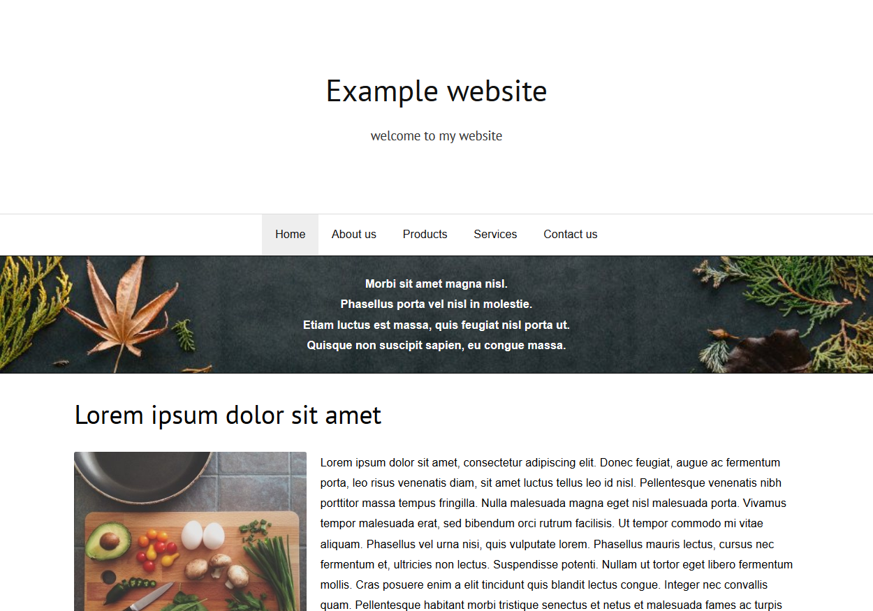
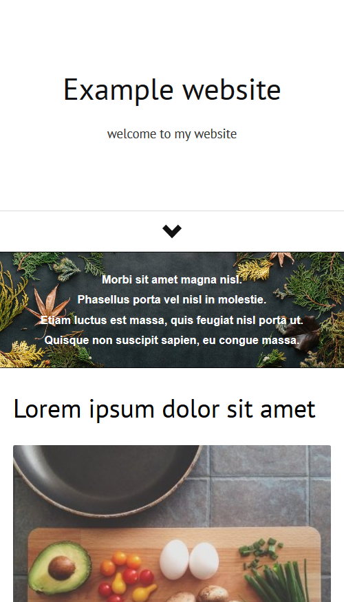
It's clear that the horizontal space on the mobile device is a lot less (there are just a few words per row).
Is the website fast?
There are a lot of technical aspects to this question, mostly related to the hosting environment and the platform used. Rarely they are the problem. Often the content of the website is the thing that slows down the experience.
Reasons why you website may appear slow:
Reasons why you website may appear slow:
- A large number of background images or background images with large sizes.
- Big GIF animations (currently they are not optimized by Bear CMS)
- A lot of Google fonts
- Inefficient code in the HTML code element
Things to do today
Open you website on a small screen (or resize your browser window) and:
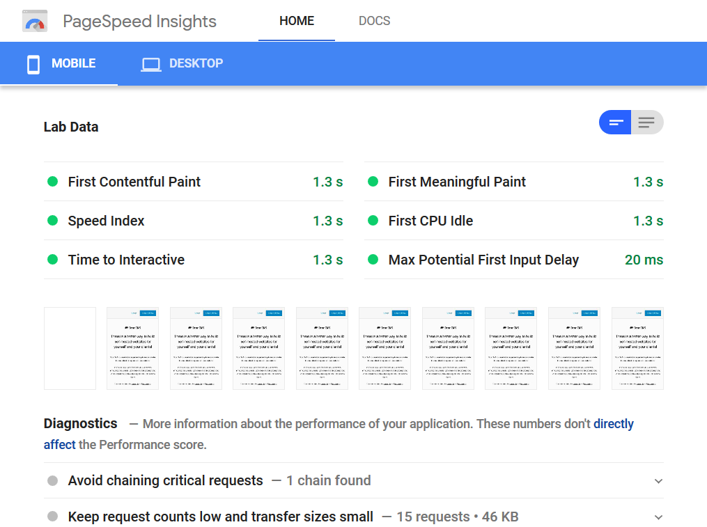
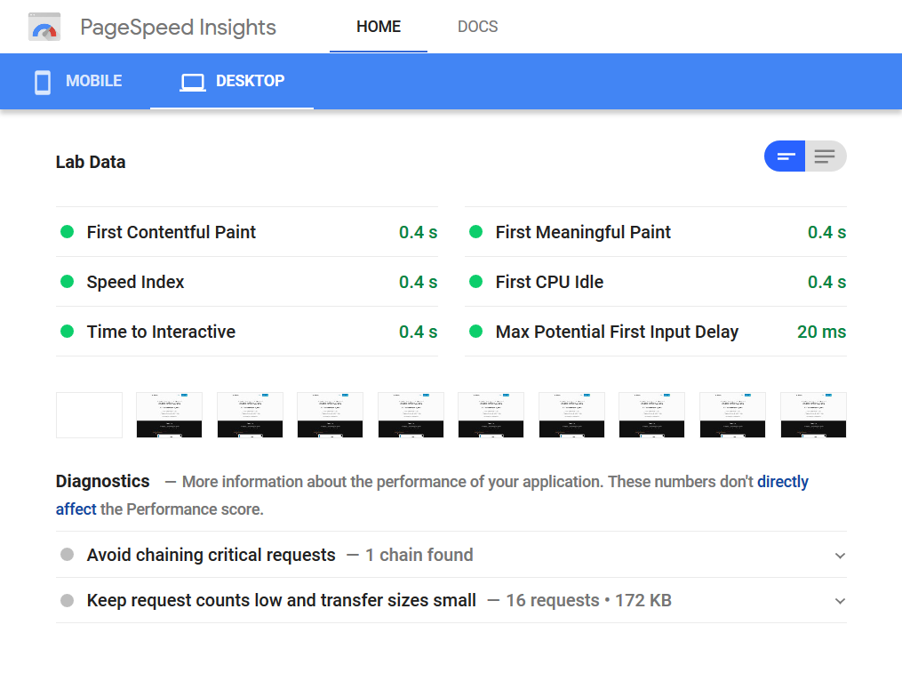
Open PageSpeed Insights
This tool will provide you real-world statistical information about your website's performance over the last 30 days. The data is provided by the Chrome User Experience Report. Improvements suggestions for mobile and desktop users are provided too. Here are the results for https://bearcms.com/
- Check if the content fits horizontally
- Is the text readable? What are its color and size?
- Is the navigation easy to use?
- Do the first elements on every page present the topic? Maybe there should be a title?
Open PageSpeed Insights
This tool will provide you real-world statistical information about your website's performance over the last 30 days. The data is provided by the Chrome User Experience Report. Improvements suggestions for mobile and desktop users are provided too. Here are the results for https://bearcms.com/
Open Google Search Console
This tool is mostly used when improving the SEO of your website, but there is information about potential mobile issues too. It's worth checking out.
This tool is mostly used when improving the SEO of your website, but there is information about potential mobile issues too. It's worth checking out.
Final words
The mobile browsing trend is not slowing down and our job as webmasters is to help our visitors no matter the size of their devices and their Internet speed. Just a few seconds too long can be critical and make a difference in acquiring a new client or a follower.